A rapidly aging society and a younger generation that is not willing to have kids is the formula for an economic Armageddon, CBS News 28 April 2015. Japan confronts this fate and their population is predicted to drop by one-third through 2060. Childbirth trend among Millennials is raising questions on the possibility America heading the same direction. According to a report from the Urban Institute, birth rate among American women in their 20s fell 15 percent in 2012 from 2007. This marked an abrupt change from three decades of relatively stable birthrates. The birth rate of women in the 20s is 948 births per 1,000 women.
Nan Marie Astone, a senior fellow at the Urban Institute and one of the paper's authors, believes the recession prompted women in their 20s to opt against having children. The paper cited previous economic crises, such as the Depression in the 1930s, also coincided with low points for fertility in 20-somethings. The median age for a women's first birth is now 26 years old, compared with 21.4 years old in 1970, according to the Centers for Disease Control and Prevention. Would millennial women start families once they feel more stable economically, as previous generations have done after periods of financial insecurity?Tuesday, 28 April 2015
Anything Under the Sun: Google’s Mobile Friendly Test
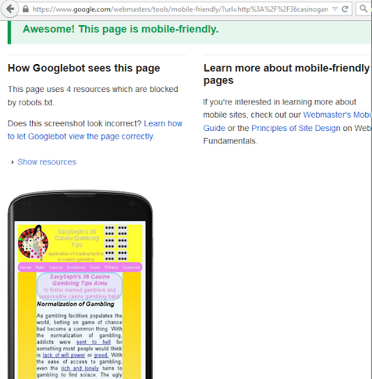
My Casino Gambling Tip is now a mobile friendly website. My next task would be to get XingCai Gambling Tales to be mobile friendly too. I had outlined the step involved to get it mobile friendly in my previous blog and will use the same procedure. The wave of mobile suffers had got Google to cater to them or lose page ranking. This would be a concern for webmasters until they fix the problem.
While Google had written to webmasters with some links to make a mobile friendly website, they provided no link to test the mobile-friendliness of the site. Using W3C tidy up could provide some additional help on the meta tags. After much surfing, I found certification from Google themselves. Visit this link and type in your website’s URL.
My Comments
Gambling Tales and Gambling Tip compliments each other.
Monday, 20 April 2015
Naked Wedding Celebrations
The South China Morning Post's article dated 24 March 2015 refers to it as "naked wedding celebrations" but it is actually a social protest. Ten couples, some were married for many years, took part in the event. The couples were covered in body paint and dressed only in undergarments for the event at Hangzhou Paradise amusement park in Zhejiang province. They are rejecting modern Chinese value that placed greater value on materialism as a criteria for marriage instead of love.
Materialism makes me think of Karl Marx. Operating under a demand driven economy, China like to think of themselves as a communist state. The term has no place for economic class struggle but after decades of opening to this system, people in China would aspire to own a house or a car before they get married. A naked wedding involves a couple marrying without possessing a house or car.
Wednesday, 15 April 2015
Anything Under the Sun: Think Small to Design Websites for Mobile
Deciding on picture size is my next task in getting my website to be mobile friendly. In my previous blog on this topic, I figured that reducing the size of navigation menu is a good place to start to design a website to fit mobile device. I used single word for title and double word for subtitle. This seems to work out some of the problem. I figure the next step would be to have a universal width for all pictures. Ideally the picture could be stretch or shrunk to fit across the multiple platforms without losing too much picture quality.
Given the size of webpages, stretching and shrinking a picture is not the real problem. Pictures who are magnify twice or reduce by half are never too shabby when it comes to quality. This should be enough do the trick to fit an image into a website. The bigger concern is manipulated images sometimes take a longer time to load. The 4G phones are great for speed but as the best for the current technology they are a minority user. Most people would have the lower 3G speed on their phones. The loyalist to old phone will still surf with 2G and there are still a number of these mobile surfers out there. These people will favor sites who were sufficiently fast for their devices.
I went window shopping for mobile phones using google and decided that I have 3 categories to please. Based on their minimum screen width, I simply name them mini (80 pixels), midi (321 pixels) and maxi (481). After throwing some math around, I decided that all images on my website will be 240 pixels wide. Shrinking 240 to 80 (the lower end of the mini) is one-third reduction. This will likely cause some problem in loading speed. For the higher end of the mini (320 pixels), the image is stretch less than 50% which is acceptable. For the 481 pixels width, there is no stretching of image. The image with text displayed by the side will be at least half of the screen.
I now had all my pictures resize to 240 pixels width. Going through the pictures one by one had been a tedious exercise. Some of my image were name by their sizes. A cat image, for example, had been named cat330x250. The 330 represent the width and 250 is for the height. I still maintain the old name of the image. It would sound silly but once something is publish it is not advisable to make changes. Keeping the old name will ensure that people who link my pictures will not get a blank image. I actually have three manga pages outstanding. These three cartoons are at least 600 pixels wide. The task will be to break them down to smaller pictures who are 240 pixels wide. The main picture that will adopt the old name while new pictures will carry the old name with a sequential numbering suffix.
Going through image by image can also make you see things from a different angle. I redraw two images. I hope the people who had link the old pictures prefer the new pictures. I had also came up with 5 new pictures. These are for the pages which previously did not have a picture. The remaining task, unless new development crops up, I will drop the navigation menu for the mini users.
My Comments
There is so much fuss over small devices these days.
Pest in Midst: Asian Beer Market
A legislative bill had been tabled to ban the sale of alcohol in Indonesia. The two Islamic parties supporting the bill cited “the protection of the children of the nation” as the reason. Bestowed with the world’s largest Muslim population, the parties recommended draconian jail sentences for offenders. Tourism officials are concerned about the economic effects of extending an alcohol ban to tourist spots like Bali.
A recent Nielsen survey found that just 2.2 percent of Indonesians over 20 had consumed alcohol in the past 12 months. Beer sales have increased by more than 50 percent over the past decade. The overall consumption is considered small for a population of over 250 million. Breweries giants Diageo, Carlsberg and Heineken are bracing for the worst in Indonesia, the world’s fourth most populous country. On the brighter side, the beer market for China is growing fast and expected to overtake the United States by 2017 the Reuters reported on 14 April 2015.
My Comments
Humans are not the most logical creature because wrecking their brain seems to be a popular form of recreation. Heck, I do it too.
Monday, 6 April 2015
Time Is a Thief: POW Vivisection Display at New Kyushu Museum
Amenda Steeles' Original Blog
A newly opened Japanese museum exposed evidence of war crime during the World War II. The museum is situated on the campus of Kyushu University in Japan. The museum, opened on April 4, features the history of medical science of the university in the past 110 years. A total of 63 items on display. The notable exhibits at the museum showed the evidence of eight US pilots vivisected by professors of the university in 1945.
The victims were eight airmen of the U.S. B-29 bomber. The aircraft was downed near the border between Kumamoto and Oita prefectures. According to the exhibit, several professors injected diluted sea water into the pilots and dissected their lungs and other organs to observe how long the victims would live after the operation, the Japan Times reported on 4 April 2015.
All eight pilots eventually died. One professor committed suicide when the war ended. The other 14 faculty members were either sentenced to life-in-prison or handed the death penalty for committing war crimes. The school treated the topic as a taboo and avoided mentioning it in public over the years. At a meeting of professors at the School of Medicine in March, the university agreed to face up to the campus' 'dark history.'
My Comments
There is something not too right about this. Diluted seawater an vivisect appears to be torture using medical experiment as an excuse. Being cut alive and adding seawater is actually adding salt to wound.
Thursday, 2 April 2015
Anything Under the Sun: My Mobile-friendly Website
ss's Original Blog
Google wrote me a warning letter about 2 weeks ago asking me to make my website more mobile friendly. Google said the increase demand in mobile phone browsing had been tremendous. Well, it is not a warning for doing something that pissed google off. It was actually a concerned notification. Google anticipated that the wave of mobile surfers will get stronger with the passage of time and webmasters were advised to cater to their needs. If I were to take it as a friendly notice I don’t need to do anything. I choose to take it as a stern warning so that I will have to adapt before I get left out.
Heck! I don't have the slightest clue where to start. I hope I could just wave a magic wand with some code and bingo! Fortunately, google is a good place to start looking for those hocus pocus code. Knowing the right keyword to punch into google would help. Next comes the endless list of reading materials on the technology to make your website flexible to multiple devices. Climbing the steep learning curve was no fun. It’s just nothing but reading without having enough knowledge to start doing something.
I concluded that it was about starting small. Fit the small screen then the bigger ones and eventually the desktop. This calls for a re-engineering as my website was catered for desktop size. I have started with reducing the size of my menu. I used single word titles for the menu items to shorten it for mobile size. Sub menu items could use double or triple word titles. Whoopee, I managed nail down some of the problem. For screen smaller than 320 pixels wide, I may have to do away with the menu. I will get around to this but the next step would be resizing all my images. I am going to do a lot of experimenting to find a good size that could be stretch or shrunk to fit across the platform without losing too much picture quality.
My Comments
I have been toying around with the concept of website for multiple devices too. I am still drown by the reading materials. What you said had provided some enlightenment. Thanks.